Mikhail Karasik. Colour is optics
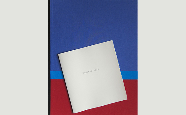
St Petersburg: M.K. Publishers, 2012.
59 × 46.5 cm. Edition: 10 copies. 10 compositions – lithograph printed by the artist on BFK Rives Cream paper, collage: original colour samples (gouache) – late 1920s – early 1930s by Valida Delakroa. Unbound. In a cardboard folder covered with book cloth. In Russian and in English; translated by Paul Williams.
For several years I kept in my archive as working material some pieces of paper shaded different colours with gouache. They had not lost their strength of colour or tone over time and sizing the backs with casein glue had prevented the strips from curling at the edges. I will not list the chain of previous owners of these swatches, but only name their creator — Valida Delakroa
The first female radio-operator in the USSR to sail on ocean-going ships, Valida Delakroa in 1922 entered VKhUTEIN (the Higher Artistic and Technical Institute, as the former Imperial Academy of Arts in Petrograd was then known) and the studio of Mikhail Vasilyevich Matiushin
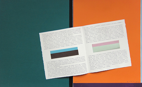
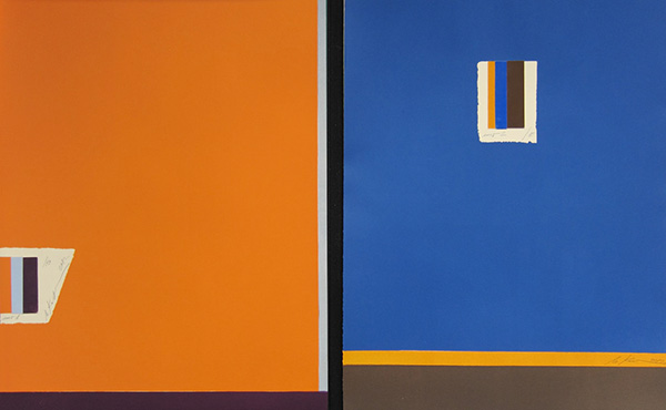
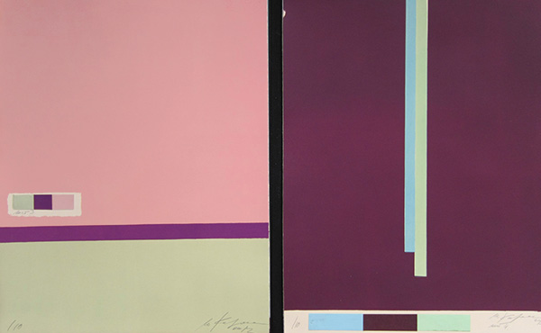
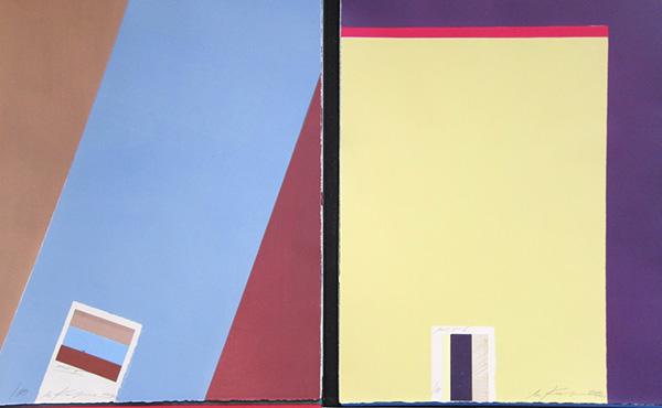
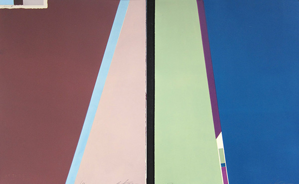
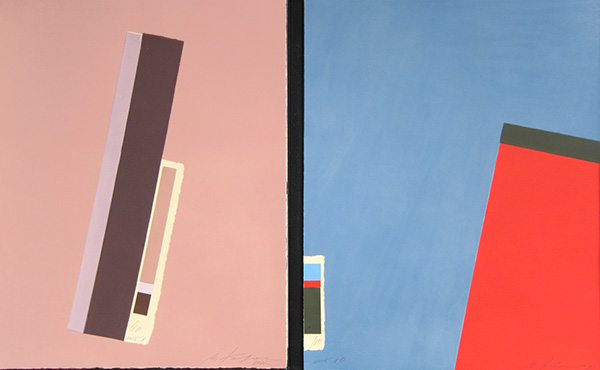
The semantic and compositional centre of each page in my album is a blank section of paper onto which a few of the original gouache swatches were pasted. The colour scheme was constructed from the material to hand. The majority of the strips were complementary or derivative colours, so I was limited in the choice not only of colour, but also of combinations. It was a difficult task to select colour, texture and tone. In contrast to the original my work is printed lithographically, a process that uses oil-based inks rather than gum paints. In order to get close to the colour of the time-yellowed paper, I used through-coloured light-ochre Rives BFK print-making paper, while the addition of opaque white to the lithographic ink made it possible to obtain a matte ‘velvety’ surface like the gouache. The main shortcoming of my palette was the lack of ‘open’ colours, including the primaries — red, blue and yellow. In distinction from those three primary colours customary in chromatics and optics, Matiushin expands the palette to eight: red, orange, yellow, yellow-green, green, light blue, dark blue and violet. On the other hand, there was no shortage of derivatives in my palette (‘all intermediates can be made up by mixing neighbouring ones’), so my colour combinations are mainly constructed on blues, browns and violets. Matiushin attributed a special role to the last: ‘these colours can be spatially balanced through a violet coupling [i.e. connecting colour].’ In the colour lithography it enters into interaction with other colours, forming new combinations, and in contrast to the black traditionally used for drawing (outlining) it is not purely ancillary.
The main scheme of combinations is founded on the principle of a coupling colour: ‘In that way, through a coupling any colours can be harmonized. This experimentally established fact has enormous practical significance, turning over a new page in the science of colour. Through a coupling we can establish the spatial interactions of colours, through a coupling we can restore brightness and purity or, on the contrary, unite — balance out indeterminately detonating colours, and so on.’ Another conclusion is that you can achieve the necessary colour using optical effects: ‘If it is desirable to obtain the impression of yellow to go with a blue but in a considerably more subdued combination, then instead of a yellow it is possible to take not a yellow at all but, for example, a dilute umber that will function as a yellow...’ This effect is well known in the printing industry and the press — for example, in particular colour surroundings ochre creates the impression of bronze or dark gold. Matiushin observes that any colour can look different depending on its combination with others.
The essence of the ‘expanded vision’ method is that the optical effect of a line appears at the boundary of adjacent areas of colour. For example, we see a pink line at the boundary of blue and brown areas. I shall quote Matiushin once more, regarding geometry in ‘expanded’ viewing: ‘The conclusions to which this work led show that cool colours have a tendency towards straight edges and the formation of angles, even if the shape has an unbroken curving boundary. On the other hand, warm colours are characterized by curvature and softness of forms, so that even pointed shapes painted with a warm colour lose the sharpness of their angles.’
In the explanatory notes to the Handbook, Mikhail Matiushin defined its main purpose as ‘confirmation of the law-governed changeability of colour combinations’. I hope that my ten-page album has provided a practical example of optical experiments with colour.